Technical Analysis Explanation
MACD
MACD, short for moving average convergence/divergence, is a trading indicator used in technical analysis of stock prices, created by Gerald Appel in the late 1970s. It is supposed to reveal changes in the strength, direction, momentum, and duration of a trend in a stock's price.
The MACD indicator (or "oscillator") is a collection of three time series calculated from historical price data, most often the closing price. These three series are: the MACD series proper, the "signal" or "average" series, and the "divergence" series which is the difference between the two. The MACD series is the difference between a "fast" (short period) exponential moving average (EMA), and a "slow" (longer period) EMA of the price series. The average series is an EMA of the MACD series itself.
The MACD indicator thus depends on three time parameters, namely the time constants of the three EMAs. The notation "MACD(a,b,c)" usually denotes the indicator where the MACD series is the difference of EMAs with characteristic times a and b, and the average series is an EMA of the MACD series with characteristic time c. These parameters are usually measured in days. The most commonly used values are 12, 26, and 9 days, that is, MACD(12,26,9). As true with most of the technical indicators, MACD also finds its period settings from the old days when technical analysis used to be mainly based on the daily charts. The reason was the lack of the modern trading platforms which show the changing prices every moment. As the working week used to be 6-days, the period settings of (12, 26, 9) represent 2 weeks, 1 month and one and a half week. Now when the trading weeks have only 5 days, possibilities of changing the period settings cannot be overruled. However, it is always better to stick to the period settings which are used by the majority of traders as the buying and selling decisions based on the standard settings further push the prices in that direction.
The MACD and average series are customarily displayed as continuous lines in a plot whose horizontal axis is time, whereas the divergence is shown as a bar graph (often called a histogram).
A fast EMA responds more quickly than a slow EMA to recent changes in a stock's price. By comparing EMAs of different periods, the MACD series can indicate changes in the trend of a stock. It is claimed that the divergence series can reveal subtle shifts in the stock's trend.
Since the MACD is based on moving averages, it is inherently a lagging indicator. As a metric of price trends, the MACD is less useful for stocks that are not trending (trading in a range) or are trading with erratic price action.
A "signal-line crossover" occurs when the MACD and average lines cross; that is, when the divergence (the bar graph) changes sign. The standard interpretation of such an event is a recommendation to buy if the MACD line crosses up through the average line (a "bullish" crossover), or to sell if it crosses down through the average line (a "bearish" crossover). These events are taken as indications that the trend in the stock is about to accelerate in the direction of the crossover. Zero crossover
A "zero crossover" event occurs when the MACD series changes sign, that is, the MACD line crosses the horizontal zero axis. This happens when there is no difference between the fast and slow EMAs of the price series. A change from positive to negative MACD is interpreted as "bearish", and from negative to positive as "bullish". Zero crossovers provide evidence of a change in the direction of a trend but less confirmation of its momentum than a signal line crossover. Divergence
A "positive divergence" or "bullish divergence" occurs when the price makes a new low but the MACD does not confirm with a new low of its own. A "negative divergence" or "bearish divergence" occurs when the price makes a new high but the MACD does not confirm with a new high of its own. A divergence with respect to price may occur on the MACD line and/or the MACD Histogram. Timing
The MACD is only as useful as the context in which it is applied. An analyst might apply the MACD to a weekly scale before looking at a daily scale, in order to avoid making short term trades against the direction of the intermediate trend. Analysts will also vary the parameters of the MACD to track trends of varying duration. One popular short-term set-up, for example, is the (5,35,5). False signals
Like any forecasting algorithm, the MACD can generate false signals. A false positive, for example, would be a bullish crossover followed by a sudden decline in a stock. A false negative would be a situation where there was no bullish crossover, yet the stock accelerated suddenly upwards. A prudent strategy may be to apply a filter to signal line crossovers to ensure that they have held up. An example of a price filter would be to buy if the MACD line breaks above the signal line and then remains above it for three days. As with any filtering strategy, this reduces the probability of false signals but increases the frequency of missed profit. Analysts use a variety of approaches to filter out false signals and confirm true ones. A MACD crossover of the signal line indicates that the direction of the acceleration is changing. The MACD line crossing zero suggests that the average velocity is changing direction.
Trading Interpretation
Exponential moving averages highlight recent changes in a stock's price. By comparing EMAs of different lengths, the MACD series gauges changes in the trend of a stock. The difference between the MACD series and its average is claimed to reveal subtle shifts in the strength and direction of a stock's trend. It may be necessary to correlate the signals with the MACD to indicators like RSI power. Some traders attribute special significance to the MACD line crossing the signal line, or the MACD line crossing the zero axis. Significance is also attributed to disagreements between the MACD line or the difference line and the stock price (specifically, higher highs or lower lows on the price series that are not matched in the indicator series). Signal-line crossoverA "signal-line crossover" occurs when the MACD and average lines cross; that is, when the divergence (the bar graph) changes sign. The standard interpretation of such an event is a recommendation to buy if the MACD line crosses up through the average line (a "bullish" crossover), or to sell if it crosses down through the average line (a "bearish" crossover). These events are taken as indications that the trend in the stock is about to accelerate in the direction of the crossover. Zero crossover
A "zero crossover" event occurs when the MACD series changes sign, that is, the MACD line crosses the horizontal zero axis. This happens when there is no difference between the fast and slow EMAs of the price series. A change from positive to negative MACD is interpreted as "bearish", and from negative to positive as "bullish". Zero crossovers provide evidence of a change in the direction of a trend but less confirmation of its momentum than a signal line crossover. Divergence
A "positive divergence" or "bullish divergence" occurs when the price makes a new low but the MACD does not confirm with a new low of its own. A "negative divergence" or "bearish divergence" occurs when the price makes a new high but the MACD does not confirm with a new high of its own. A divergence with respect to price may occur on the MACD line and/or the MACD Histogram. Timing
The MACD is only as useful as the context in which it is applied. An analyst might apply the MACD to a weekly scale before looking at a daily scale, in order to avoid making short term trades against the direction of the intermediate trend. Analysts will also vary the parameters of the MACD to track trends of varying duration. One popular short-term set-up, for example, is the (5,35,5). False signals
Like any forecasting algorithm, the MACD can generate false signals. A false positive, for example, would be a bullish crossover followed by a sudden decline in a stock. A false negative would be a situation where there was no bullish crossover, yet the stock accelerated suddenly upwards. A prudent strategy may be to apply a filter to signal line crossovers to ensure that they have held up. An example of a price filter would be to buy if the MACD line breaks above the signal line and then remains above it for three days. As with any filtering strategy, this reduces the probability of false signals but increases the frequency of missed profit. Analysts use a variety of approaches to filter out false signals and confirm true ones. A MACD crossover of the signal line indicates that the direction of the acceleration is changing. The MACD line crossing zero suggests that the average velocity is changing direction.
RSI
The relative strength index (RSI) is a technical indicator used in the analysis of financial markets. It is intended to chart the current and historical strength or weakness of a stock or market based on the closing prices of a recent trading period. The indicator should not be confused with relative strength. The RSI is classified as a momentum oscillator, measuring the velocity and magnitude of directional price movements. Momentum is the rate of the rise or fall in price. The RSI computes momentum as the ratio of higher closes to lower closes: stocks which have had more or stronger positive changes have a higher RSI than stocks which have had more or stronger negative changes. The RSI is most typically used on a 14 day timeframe, measured on a scale from 0 to 100, with high and low levels marked at 70 and 30, respectively. Shorter or longer timeframes are used for alternately shorter or longer outlooks. More extreme high and low levels-80 and 20, or 90 and 10-occur less frequently but indicate stronger momentum. The relative strength index was developed by J. Welles Wilder and published in a 1978 book, New Concepts in Technical Trading Systems, and in Commodities magazine (now Futures magazine) in the June 1978 issue. It has become one of the most popular oscillator indices.
Interpretation
Basic configurationThe RSI is presented on a graph above or below the price chart. The indicator has an upper line, typically at 70, a lower line at 30, and a dashed mid-line at 50. Wilder recommended a smoothing period of 14 (see EMA smoothing, i.e. a = 1/14 or N = 27). Principles
Wilder posited that when price moves up very rapidly, at some point it is considered overbought. Likewise, when price falls very rapidly, at some point it is considered oversold. In either case, Wilder deemed a reaction or reversal imminent. The level of the RSI is a measure of the stock's recent trading strength. The slope of the RSI is directly proportional to the velocity of a change in the trend. The distance traveled by the RSI is proportional to the magnitude of the move. Wilder believed that tops and bottoms are indicated when RSI goes above 70 or drops below 30. Traditionally, RSI readings greater than the 70 level are considered to be in overbought territory, and RSI readings lower than the 30 level are considered to be in oversold territory. In between the 30 and 70 level is considered neutral, with the 50 level a sign of no trend. Divergence
Wilder further believed that divergence between RSI and price action is a very strong indication that a market turning point is imminent. Bearish divergence occurs when price makes a new high but the RSI makes a lower high, thus failing to confirm. Bullish divergence occurs when price makes a new low but RSI makes a higher low.
Average True Range
Average true range (ATR) is a technical analysis volatility indicator originally developed by J. Welles Wilder, Jr. for commodities. The indicator does not provide an indication of price trend, simply the degree of price volatility. The average true range is an N-day exponential moving average of the true range values. Wilder recommended a 14-period smoothing.
Since true range and ATR are calculated by subtracting prices, the volatility they compute does not change when historical prices are back-adjusted by adding or subtracting a constant to every price. Back-adjustments are often employed when splicing together individual monthly futures contracts to form a continuous futures contract spanning a long period of time. However the standard procedures used to compute volatility of stock prices, such as the standard deviation of logarithmic price ratios, are not invariant (to addition of a constant). Thus futures traders and analysts typically use one method (ATR) to calculate volatility, while stock traders and analysts typically use another (SD of log price ratios). Use in position size calculation
Apart from being a trend strength gauge, ATR serves as an element of position sizing in financial trading. Current ATR value (or a multiple of it) can be used as the size of the potential adverse movement (stop-loss distance) when calculating the trade volume based on trader's risk tolerance. In this case, ATR provides a self-adjusting risk limit dependent on the market volatility for strategies without a fixed stop-loss placement.[6] A less volatile market has a larger trading position in comparison to a more volatile market in a portfolio.
Interpretation
Applicability to futures contracts vs. stocksSince true range and ATR are calculated by subtracting prices, the volatility they compute does not change when historical prices are back-adjusted by adding or subtracting a constant to every price. Back-adjustments are often employed when splicing together individual monthly futures contracts to form a continuous futures contract spanning a long period of time. However the standard procedures used to compute volatility of stock prices, such as the standard deviation of logarithmic price ratios, are not invariant (to addition of a constant). Thus futures traders and analysts typically use one method (ATR) to calculate volatility, while stock traders and analysts typically use another (SD of log price ratios). Use in position size calculation
Apart from being a trend strength gauge, ATR serves as an element of position sizing in financial trading. Current ATR value (or a multiple of it) can be used as the size of the potential adverse movement (stop-loss distance) when calculating the trade volume based on trader's risk tolerance. In this case, ATR provides a self-adjusting risk limit dependent on the market volatility for strategies without a fixed stop-loss placement.[6] A less volatile market has a larger trading position in comparison to a more volatile market in a portfolio.
Directional Movement
The average directional movement index (ADX) was developed in 1978 by J. Welles Wilder as an indicator of trend strength in a series of prices of a financial instrument. ADX has become a widely used indicator for technical analysts, and is provided as a standard in collections of indicators offered by various trading platforms.
Interpretation
The ADX does not indicate trend direction or momentum, only trend strength. It is a lagging indicator; that is, a trend must have established itself before the ADX will generate a signal that a trend is under way. ADX will range between 0 and 100. Generally, ADX readings below 20 indicate trend weakness, and readings above 40 indicate trend strength. An extremely strong trend is indicated by readings above 50. Alternative interpretations have also been proposed and accepted among technical analysts. For example it has been shown how ADX is a reliable coincident indicator of classical chart pattern development, whereby ADX readings below 20 occur just prior to pattern breakouts. TimingVarious market timing methods have been devised using ADX. One of these methods is discussed by Alexander Elder in his book Trading for a Living. According to Elder, there is a buy signal when the ADX peaks and starts to decline when the +DI is above the -DI. With this strategy you would sell when the ADX stops falling and goes flat.
Momentum
Momentum and rate of change (ROC) are simple technical analysis indicators showing the difference between today's closing price and the close N days ago. Momentum is the absolute difference in stock, commodity.
"Momentum" in general refers to prices continuing to trend. The momentum and ROC indicators show trend by remaining positive while an uptrend is sustained, or negative while a downtrend is sustained.
A crossing up through zero may be used as a signal to buy, or a crossing down through zero as a signal to sell. How high (or how low when negative) the indicators get shows how strong the trend is.
The way momentum shows an absolute change means it shows for instance a $3 rise over 20 days, whereas ROC might show that as 0.25 for a 25% rise over the same period. One can choose between looking at a move in dollar terms, relative point terms, or proportional terms. The zero crossings are the same in each, of course, but the highs or lows showing strength are on the respective different bases.
The conventional interpretation is to use momentum as a trend-following indicator. This means that when the indicator peaks and begins to descend, it can be considered a sell signal. The opposite conditions can be interpreted when the indicator bottoms out and begins to rise.
SMA
Momentum is the change in an N-day simple moving average (SMA) between yesterday and today, with a scale factor N+1. This is the slope or steepness of the SMA line, like a derivative. This relationship is not much discussed generally, but it's of interest in understanding the signals from the indicator. When momentum crosses up through zero it corresponds to a trough in the SMA, and when it crosses down through zero it's a peak. How high (or low) momentum gets represents how steeply the SMA is rising (or falling). The TRIX indicator is similarly based on changes in a moving average (a triple exponential in that case).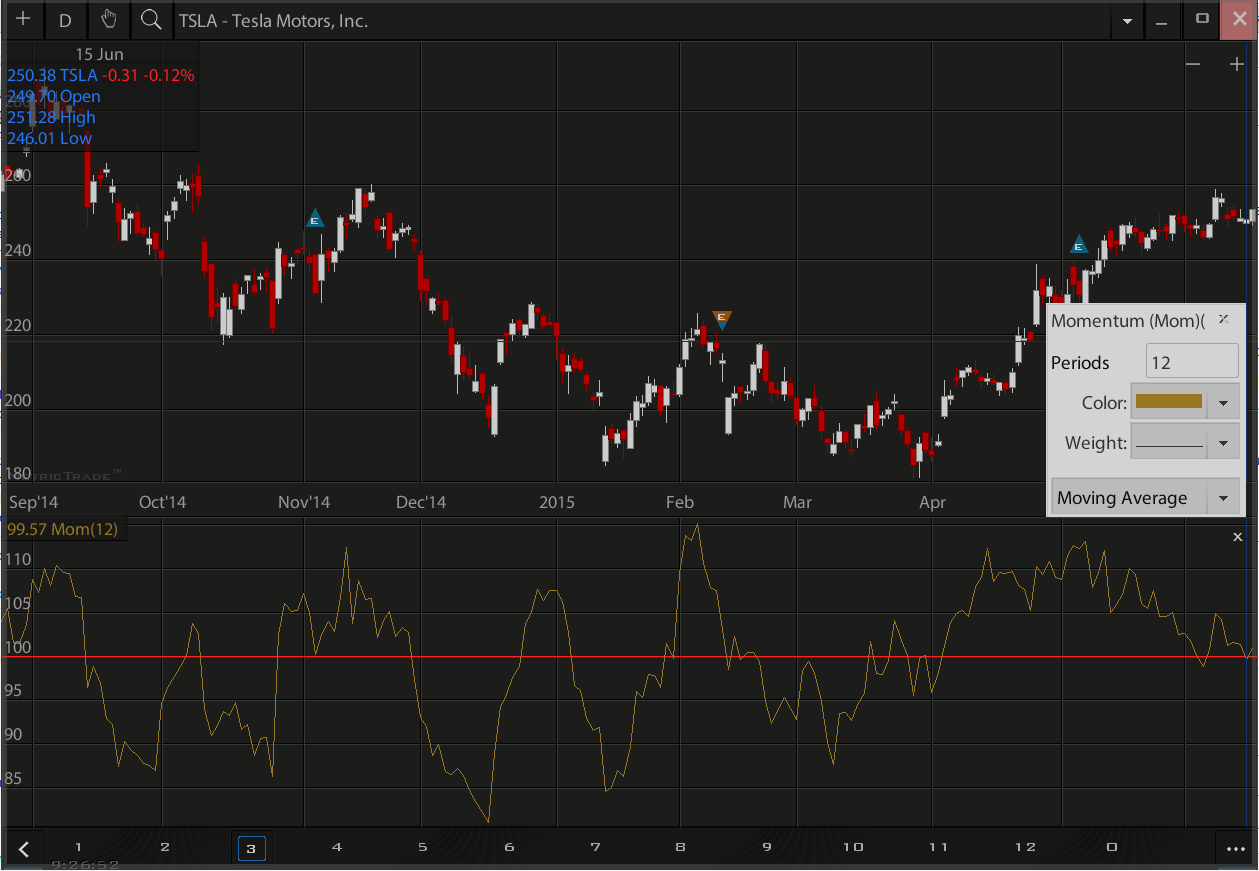
Bollinger Bands
Bollinger Bands is a technical analysis tool invented by John Bollinger in the 1980s as well as a term trademarked by him in 2011. Having evolved from the concept of trading bands, Bollinger Bands and the related indicators %b and bandwidth can be used to measure the "highness" or "lowness" of the price relative to previous trades. Bollinger Bands are a volatility indicator similar to the Keltner channel.
Bollinger Bands consist of:
an N-period moving average (MA)
an upper band at K times an N-period standard deviation above the moving average (MA + Ks)
a lower band at K times an N-period standard deviation below the moving average (MA - Ks)
Typical values for N and K are 20 and 2, respectively. The default choice for the average is a simple moving average, but other types of averages can be employed as needed. Exponential moving averages is a common second choice. Usually the same period is used for both the middle band and the calculation of standard deviation.
Interpretation
The use of Bollinger Bands varies widely among traders. Some traders buy when price touches the lower Bollinger Band and exit when price touches the moving average in the center of the bands. Other traders buy when price breaks above the upper Bollinger Band or sell when price falls below the lower Bollinger Band. Moreover, the use of Bollinger Bands is not confined to stock traders; options traders, most notably implied volatility traders, often sell options when Bollinger Bands are historically far apart or buy options when the Bollinger Bands are historically close together, in both instances, expecting volatility to revert towards the average historical volatility level for the stock. When the bands lie close together, a period of low volatility is indicated. Conversely, as the bands expand, an increase in price action/market volatility is indicated. When the bands have only a slight slope and track approximately parallel for an extended time, the price will generally be found to oscillate between the bands as though in a channel. Traders are often inclined to use Bollinger Bands with other indicators to confirm price action. In particular, the use of oscillator-like Bollinger Bands will often be coupled with a non-oscillator indicator-like chart patterns or a trendline. If these indicators confirm the recommendation of the Bollinger Bands, the trader will have greater conviction that the bands are predicting correct price action in relation to market volatility.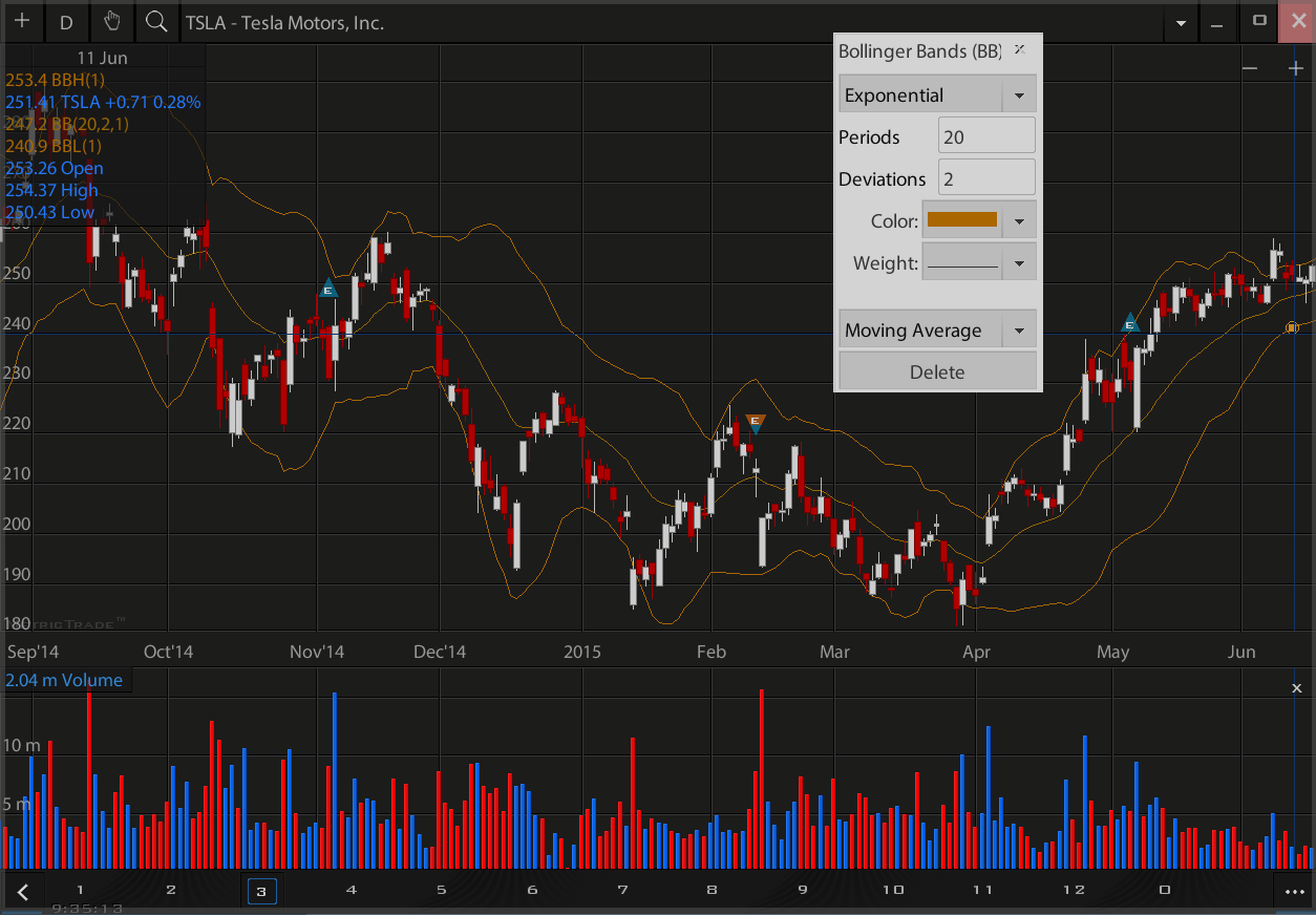
TTM Squeeze
The Squeeze indicator measures the relationship between two studies: Bollinger Bands and Keltner's Channels. When the volatility increases, so does the distance between the bands, conversely, when the volatility declines, the distance also decreases. The Squeeze indicator finds sections of the Bollinger Bands study which fall inside the Keltner's Channels. When the market finishes a move, the indicator turns off, which corresponds to bands having pushed well outside the range of Keltner's Channels. To produce Buy/Sell signals, the Squeeze indicator is plotted along with Momentum Oscillator. The Momentum Oscillator histogram is smoothed up with linear regression and other techniques. When the indicator is on (green) and the Momentum Oscillator is colored cyan, it is considered a Buy signal (this signal is supposed to be correct until two blue bars in a row). When the indicator is on and the Momentum Oscillator is red, it is considered a Sell signal (this signal is supposed to be correct until two yellow bars in a row). When the indicator is off (red), no trade is recommended.
Key Points
The TTM squeeze indicator was developed to keep from going cross eyed from looking at all of the line crosses. The TTM squeeze indicator visually represents what is happening with all of the lines. The TTM Squeeze Indicator is very easy strategy to learn and works on all time frames. We like the Two Minute and Five Minute time frames the best. The TTM Squeeze Indicator normal signal is red dots, no trade. When green dots appears, it means that the TTM squeeze indicator is on. When a red dot is followed by a green dot, it means that the TTM squeeze indicator has fired, volatility is expanding. The histogram(the vertical lines) is a measure of momentum; If it is blue we go long, if it is red we go short.Keltner channel
Keltner channel is a technical analysis indicator showing a central moving average line plus channel lines at a distance above and below. The indicator is named after Chester W. Keltner (1909-1998) who described it in his 1960 book How To Make Money in Commodities. This name was applied by those who heard about it from him, but Keltner called it the ten-day moving average trading rule and indeed made no claim to any originality for the idea.
In Keltner's description the centre line is a 10-day simple moving average of typical price, where typical price each day is the average of high, low and close.
The lines above and below are drawn a distance from that centre line, a distance which is the simple moving average of the past 10 days' trading ranges (i.e. range high to low on each day).
The trading strategy is to regard a close above the upper line as a strong bullish signal, or a close below the lower line as strong bearish sentiment, and buy or sell with the trend accordingly, but perhaps with other indicators to confirm.
The origin of this idea is uncertain. Keltner was a Chicago grain trader and perhaps it was common knowledge among traders of the day. Or in the 1930s as a young man Keltner worked for Ralph Ainsworth (1884-1965) backtesting trading systems submitted when Ainsworth offered a substantial prize for a winning strategy, so it could have been among those. But ideas of channels with fixed widths go back to the earliest days of charting, so perhaps applying some averaging is not an enormous leap in any case.
Later authors, such as Linda Bradford Raschke, have published modifications for the Keltner channel, such as different averaging periods; or an exponential moving average; or using a multiple of Wilder's average true range (ATR) for the bands. These variations have merit, but are often still just called Keltner channel, creating some confusion as to what exactly one gets from an indicator called that.
Interpretation
Indicators based on channels, bands and envelopes are designed to encompass most price action. Therefore, moves above or below the channel lines warrant attention because they are relatively rare. Trends often start with strong moves in one direction or another. A surge above the upper channel line shows extraordinary strength, while a plunge below the lower channel line shows extraordinary weakness. Such strong moves can signal the end of one trend and the beginning of another. With an exponential moving average as its foundation, Keltner Channels are a trend following indicator. As with moving averages and trend following indicators, Keltner Channels lag price action. The direction of the moving average dictates the direction of the channel. In general, a downtrend is present when the channel moves lower, while an uptrend exists when the channel moves higher. The trend is flat when the channel moves sideways. A channel upturn and break above the upper trendline can signal the start of an uptrend. A channel downturn and break below the lower trendline can signal the start a downtrend. Sometimes a strong trend does not take hold after a channel breakout and prices oscillate between the channel lines. Such trading ranges are marked by a relatively flat moving average. The channel boundaries can then be used to identify overbought and oversold levels for trading purposes.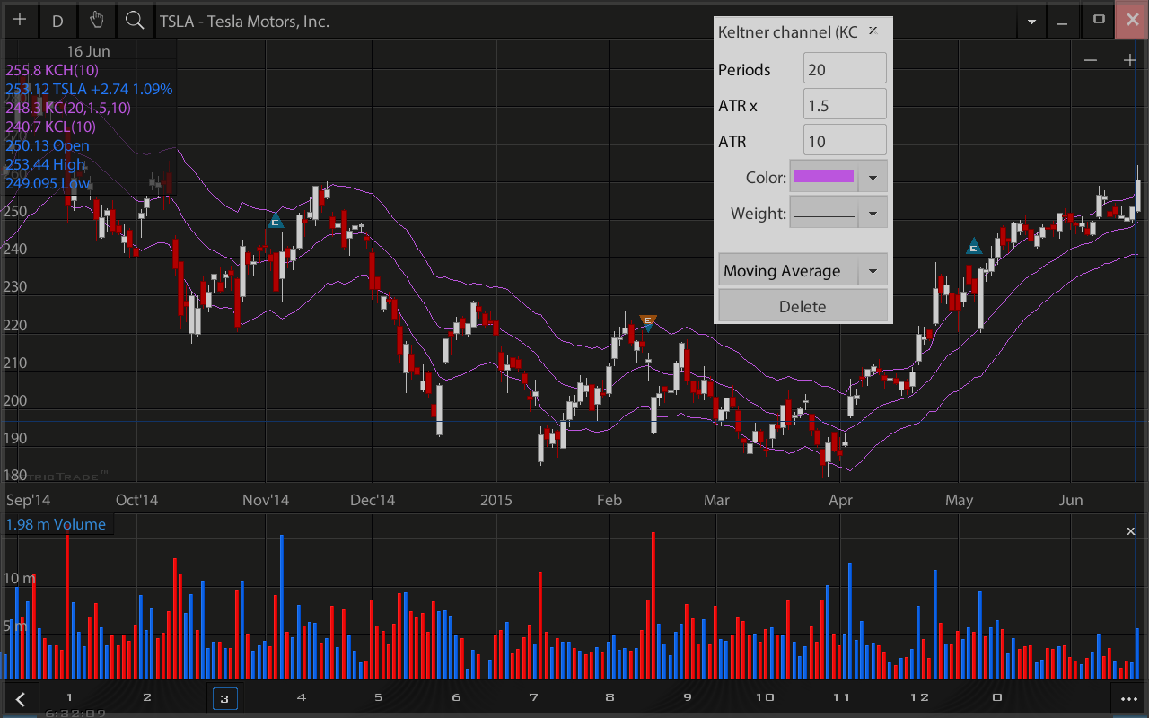
Parabolic SAR
In stock and securities market technical analysis, parabolic SAR (parabolic stop and reverse) is a method devised by J. Welles Wilder, Jr., to find potential reversals in the market price direction of traded goods such as securities or currency exchanges such as forex.[1] It is a trend-following (lagging) indicator and may be used to set a trailing stop loss or determine entry or exit points based on prices tending to stay within a parabolic curve during a strong trend. Similar to option theory's concept of time decay, the concept draws on the idea that "time is the enemy". Thus, unless a security can continue to generate more profits over time, it should be liquidated. The indicator generally works only in trending markets, and creates "whipsaws" during ranging or, sideways phases. Therefore, Wilder recommends first establishing the direction or change in direction of the trend through the use of parabolic SAR, and then using a different indicator such as the Average Directional Index to determine the strength of the trend. A parabola below the price is generally bullish, while a parabola above is generally bearish.
Interpretation
SAR follows price and can be considered a trend following indicator. Once a downtrend reverses and starts up, SAR follows prices like a trailing stop. The stop continuously rises as long as the uptrend remains in place. In other words, SAR never decreases in an uptrend and continuously protects profits as prices advance. The indicator acts as a guard against the propensity to lower a stop-loss. Once price stops rising and reverses below SAR, a downtrend starts and SAR is above the price. SAR follows prices lower like a trailing stop. The stop continuously falls as long as the downtrend extends. Because SAR never rises in a downtrend, it continuously protects profits on short positions.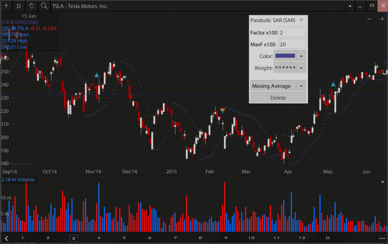
Fibonacci Pivot Points
In financial markets, a pivot point is a price level that is used by traders as a possible indicator of market movement. A pivot point is calculated as an average of significant prices (high, low, close) from the performance of a market in the prior trading period. If the market in the following period trades above the pivot point it is usually evaluated as a bullish sentiment, whereas trading below the pivot point is seen as bearish. It is customary to calculate additional levels of support and resistance, below and above the pivot point, respectively, by subtracting or adding price differentials calculated from previous trading ranges of the market.[citation needed] A pivot point and the associated support and resistance levels are often turning points for the direction of price movement in a market.[citation needed] In an up-trending market, the pivot point and the resistance levels may represent a ceiling level in price above which the uptrend is no longer sustainable and a reversal may occur. In a declining market, a pivot point and the support levels may represent a low price level of stability or a resistance to further decline.
Support and resistance levels
Price support and resistance levels are key trading tools in any market. Their roles may be interchangeable, depending on whether the price level is approached in an up-trending or a down-trending market. These price levels may be derived from many market assumptions and conventions. In pivot point analysis, several levels, usually three, are commonly recognized below and above the pivot point. These are calculated from the range of price movement in the previous trading period, added to the pivot point for resistances and subtracted from it for support levels. The first and most significant level of support (S1) and resistance (R1) is obtained by recognition of the upper and the lower halves of the prior trading range, defined by the trading above the pivot point (H - P), and below it (P - L). The first resistance on the up-side of the market is given by the lower width of prior trading added to the pivot point price and the first support on the down-side is the width of the upper part of the prior trading range below the pivot point.Trading Tool
The pivot point itself represents a level of highest resistance or support, depending on the overall market condition. If the market is directionless (undecided), prices may fluctuate greatly around this level until a price breakout develops. Trading above or below the pivot point indicates the overall market sentiment. It is a leading indicator providing advanced signaling of potentially new market highs or lows within a given time frame.[2] The support and resistance levels calculated from the pivot point and the previous market width may be used as exit points of trades, but are rarely used as entry signals. For example, if the market is up-trending and breaks through the pivot point, the first resistance level is often a good target to close a position, as the probability of resistance and reversal increases greatly. Many traders recognize the half-way levels between any of these levels as additional, but weaker resistance or support areas. The half-way (middle) point between the pivot point and R1 is designated M+, between R1 and R2 is M++, and below the pivot point the middle points are labeled as M- and M--. In the 5-day intra-day chart of the SPDR Gold Trust (above) the middle points can clearly be identified as support in days 1, 3, and 4, and as resistance in days 2 and 3.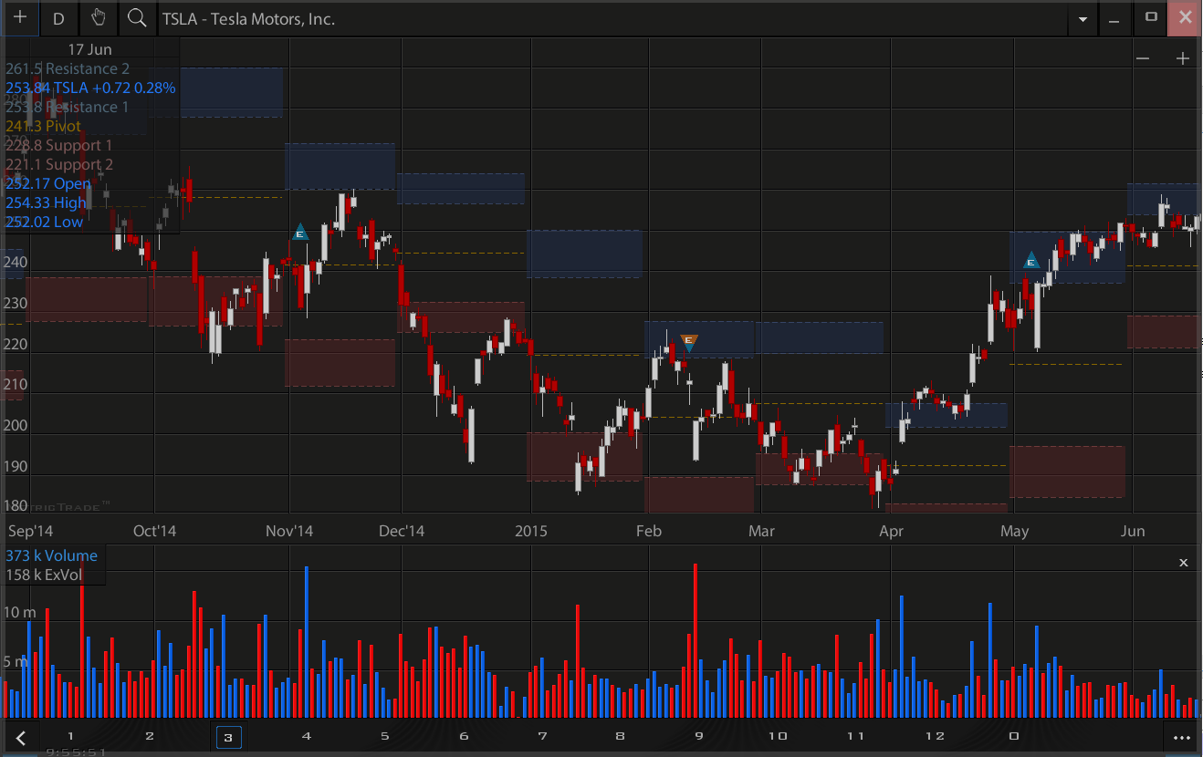
Moving Average Envelopes
Moving Average Envelopes are percentage-based envelopes set above and below a moving average. The moving average, which forms the base for this indicator, can be a simple or exponential moving average. Each envelope is then set the same percentage above or below the moving average. This creates parallel bands that follow price action. With a moving average as the base, Moving Average Envelopes can be used as a trend following indicator. However, this indicator is not limited to just trend following. The envelopes can also be used to identify overbought and oversold levels when the trend is relatively flat.
Interpretation
Indicators based on channels, bands and envelopes are designed to encompass most price action. Therefore, moves above or below the envelopes warrant attention. Trends often start with strong moves in one direction or another. A surge above the upper envelope shows extraordinary strength, while a plunge below the lower envelope shows extraordinary weakness. Such strong moves can signal the end of one trend and the beginning of another. With a moving average as its foundation, Moving Average Envelopes are a natural trend following indicator. As with moving averages, the envelopes will lag price action. The direction of the moving average dictates the direction of the channel. In general, a downtrend is present when the channel moves lower, while an uptrend exists when the channel moves higher. The trend is flat when the channel moves sideways. Sometimes a strong trend does not take hold after an envelope break and prices move into a trading range. Such trading ranges are marked by a relatively flat moving average. The envelopes can then be used to identify overbought and oversold levels for trading purposes. A move above the upper envelope denotes an overbought situation, while a move below the lower envelope marks an oversold condition.Parameters
The parameters for the Moving Average Envelopes depend on your trading/investing objectives and the characteristics of the security involved. Traders will likely use shorter (faster) moving averages and relatively tight envelopes. Investors will likely prefer longer (slower) moving averages with wider envelopes. A security's volatility will also influence the parameters. Bollinger Bands and Keltner Channels have built in mechanisms that automatically adjust to a security's volatility. Bollinger Bands use the standard deviation to set bandwidth. Keltner Channels use the Average True Range (ATR) to set channel width. These automatically adjust for volatility. Chartists must independently account for volatility when setting the Moving Average Envelopes. Securities with high volatility will require wider bands to encompass most price action. Securities with low volatility can use narrower bands.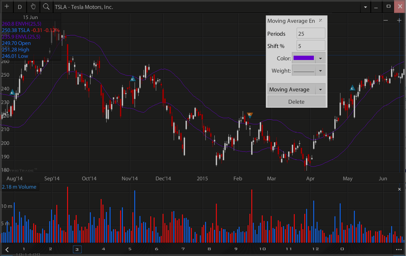
Ichimoku
Ichimoku Kinko Hyo usually just called ichimoku is a technical analysis method that builds on candlestick charting to improve the accuracy of forecast price moves. It was developed in the late 1930s by Goichi Hosoda, a Japanese journalist who used to be known as Ichimoku Sanjin, which can be translated as "what a man in the mountain sees". He spent thirty years perfecting the technique before releasing his findings to the general public in the late 1960s.
Ichimoku Kinko Hyo translates to 'one glance equilibrium chart' or 'instant look at the balance chart' and is sometimes referred to as 'one glance cloud chart' based on the unique 'clouds' that feature in ichimoku charting.
Ichimoku is a moving average-based trend identification system and because it contains more data points than standard candlestick charts, provides a clearer picture of potential price action. The main difference between how moving averages are plotted in ichimoku as opposed to other methods is that ichimoku's lines are constructed using the 50% point of the highs and lows as opposed to the candle's closing price.
Ichimoku factors in time as an additional element along with the price action, similar to William Delbert Gann's trading ideas.
Popular in Japan, ichimoku is gaining traction in the west through proponents of its charting accuracy.
Tenkan-sen calculation: (highest high + lowest low)/2 for the last 9 periods. It is primarily used as a signal line and a minor support/resistance line.Tenkan Sen (red line): This is also known as the turning line and is derived by averaging the highest high and the lowest low for the past nine periods. The Tenkan Sen is an indicator of the market trend. If the red line is moving up or down, it indicates that the market is trending. If it moves horizontally, it signals that the market is ranging. Kijun-sen
Kijun-sen calculation: (highest high + lowest low)/2 for the past 26 periods. This is a confirmation line, a support/resistance line, and can be used as a trailing stop line. the Kijun Sen acts as an indicator of future price movement. If the price is higher than the blue line, it could continue to climb higher. If the price is below the blue line, it could keep dropping. Senkou span A
Senkou span A calculation: (Tenkan-sen + kijun-sen)/2 plotted 26 periods ahead. Also called leading span 1, this line forms one edge of the kumo, or cloud If the price is above the Senkou span, the top line serves as the first support level while the bottom line serves as the second support level. If the price is below the Senkou span, the bottom line forms the first resistance level while the top line is the second resistance level. Senkou span B
Senkou span B calculation: (highest high + lowest low)/2 calculated over the past 52 time periods and plotted 26 periods ahead. Also called leading span 2, this line forms the other edge of the kumo. Kumo
Kumo (cloud) is the space between senkou span A and B. The cloud edges identify current and potential future support and resistance points. The Kumo cloud changes in shape and height based on price changes. This height represents volatility as larger price movements form thicker clouds, which creates a stronger support and resistance. As thinner clouds offer only weak support and resistance, prices can and tend to break through such thin clouds. Generally, markets are bullish when Senkou Span A is above Senkou Span B and vice versa when markets are bearish. Traders often look for Kumo Twists in future clouds, where Senkou Span A and B exchange positions, a signal of potential trend reversals. In addition to thickness, the strength of the cloud can also be ascertained by its angle; upwards for bullish and downwards for bearish. Any clouds behind price are also known as Kumo Shadows. Chikou span
Chikou span calculation: today's closing price projected back 26 days on the chart. Also called the lagging span it is used as a support/resistance aid. If the Chikou Span or the green line crosses the price in the bottom-up direction, that is a buy signal. If the green line crosses the price from the top-down, that is a sell signal.
The key elements of the ichimoku chart
Tenkan-senTenkan-sen calculation: (highest high + lowest low)/2 for the last 9 periods. It is primarily used as a signal line and a minor support/resistance line.Tenkan Sen (red line): This is also known as the turning line and is derived by averaging the highest high and the lowest low for the past nine periods. The Tenkan Sen is an indicator of the market trend. If the red line is moving up or down, it indicates that the market is trending. If it moves horizontally, it signals that the market is ranging. Kijun-sen
Kijun-sen calculation: (highest high + lowest low)/2 for the past 26 periods. This is a confirmation line, a support/resistance line, and can be used as a trailing stop line. the Kijun Sen acts as an indicator of future price movement. If the price is higher than the blue line, it could continue to climb higher. If the price is below the blue line, it could keep dropping. Senkou span A
Senkou span A calculation: (Tenkan-sen + kijun-sen)/2 plotted 26 periods ahead. Also called leading span 1, this line forms one edge of the kumo, or cloud If the price is above the Senkou span, the top line serves as the first support level while the bottom line serves as the second support level. If the price is below the Senkou span, the bottom line forms the first resistance level while the top line is the second resistance level. Senkou span B
Senkou span B calculation: (highest high + lowest low)/2 calculated over the past 52 time periods and plotted 26 periods ahead. Also called leading span 2, this line forms the other edge of the kumo. Kumo
Kumo (cloud) is the space between senkou span A and B. The cloud edges identify current and potential future support and resistance points. The Kumo cloud changes in shape and height based on price changes. This height represents volatility as larger price movements form thicker clouds, which creates a stronger support and resistance. As thinner clouds offer only weak support and resistance, prices can and tend to break through such thin clouds. Generally, markets are bullish when Senkou Span A is above Senkou Span B and vice versa when markets are bearish. Traders often look for Kumo Twists in future clouds, where Senkou Span A and B exchange positions, a signal of potential trend reversals. In addition to thickness, the strength of the cloud can also be ascertained by its angle; upwards for bullish and downwards for bearish. Any clouds behind price are also known as Kumo Shadows. Chikou span
Chikou span calculation: today's closing price projected back 26 days on the chart. Also called the lagging span it is used as a support/resistance aid. If the Chikou Span or the green line crosses the price in the bottom-up direction, that is a buy signal. If the green line crosses the price from the top-down, that is a sell signal.